Merge lp://staging/~wallyworld/launchpad/private-dupe-bug-warning3 into lp://staging/launchpad

Proposed by Ian Booth
Status: Merged
Approved by: Curtis Hovey
Approved revision: no longer in the source branch.
Merged at revision: 15719
Proposed branch: lp://staging/~wallyworld/launchpad/private-dupe-bug-warning3
Merge into: lp://staging/launchpad
Prerequisite: lp://staging/~wallyworld/launchpad/private-dupe-bug-warning2-943497
Diff against target: 494 lines (+253/-24)
8 files modified
lib/canonical/launchpad/icing/css/forms.css (+1/-1)
lib/lp/bugs/browser/tests/test_bugs.py (+27/-0)
lib/lp/bugs/interfaces/malone.py (+18/-0)
lib/lp/bugs/javascript/bugtask_index.js (+6/-1)
lib/lp/bugs/javascript/duplicates.js (+63/-14)
lib/lp/bugs/javascript/tests/test_duplicates.js (+79/-8)
lib/lp/bugs/tests/test_searchtasks_webservice.py (+33/-0)
lib/lp/systemhomes.py (+26/-0)
To merge this branch: bzr merge lp://staging/~wallyworld/launchpad/private-dupe-bug-warning3
Reviewer Review Type Date Requested Status
Curtis Hovey (community) code Approve
Review via email: mp+116997@code.staging.launchpad.net

Description of the change

== Implementation ==

Thus branch completes the first round of work to improve the bug dupe form. Main new features compared with previous branch:

- Short circuit some checks
If the same bug number as the current bug is entered, of the same bug number as the current dupe, no search is done and a suitable error message is displayed iommediately.

- Display privacy warning
If the current bug is public and the proposed dupe bug is private, display a warning
(improvements to message text welcome)

- All correct bug data retrieved from server

The implementation adds a new method getBugData() to IMaloneApplication and exposes it as a named ws op on the /bugs web service interface. The method currently takes just the one search criteria (bug_id) but can be extended if we want to allow searching on pillar and key words. The getBugData method returns a list of json bug data.
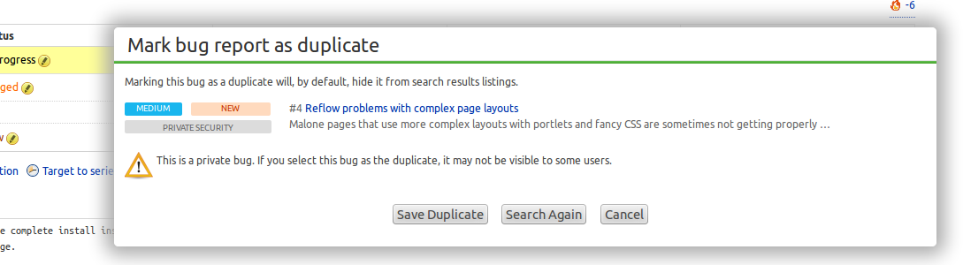
==Demo and QA ==

Here's a screenshot of the privacy warning.

http://people.canonical.com/~ianb/bug-dupe-privacy-warning.png

== Tests ==

Extend yui tests
Add tests for getBugData (for direct call and via web service)

== Lint ==

Checking for conflicts and issues in changed files.

Linting changed files:
  lib/lp/systemhomes.py
  lib/lp/bugs/browser/tests/test_bugs.py
  lib/lp/bugs/interfaces/malone.py
  lib/lp/bugs/javascript/bugtask_index.js
  lib/lp/bugs/javascript/duplicates.js
  lib/lp/bugs/javascript/tests/test_duplicates.js
  lib/lp/bugs/tests/test_searchtasks_webserv

To post a comment you must log in.
Revision history for this message
Curtis Hovey (sinzui) wrote :

Hi Ian.

The code looks fine, but I have some concerns about the layout and messages. I think we want to decide what we want to do about these issues, and decide which branch we want to address them

1. The buttons in the screenshot are centred. No design guidelines for any os/web site I have seen suggest centred is correct. Maybe the centreing is an illusion created by the very large content of the bug listing extending beyond the width of the other elements. Lp's rules state the forms action buttons are to bottom left. lazr would place them at the bottom right. We don't have many example align right with real button -- The create milestone overlay is the only one I recall.

2. More bother. The Lp's overlays prefer to make the data the action. So in the screenshot, The cancel action would be the cancel button in the upper right corner, The search field would always be visible so search again is not needed. Plus, taking the search away implies a two step picker and the green progress bar says there is only one step. So instead of Save Duplicate, the user would choose the bug in the listing...but this is not a list. We don't want a listing either. The link to the found bug will reload my page and I loose state. Like the person picker if we need a link we need to be clear that the user can "view details" with a icon telling the user that the link opens a new window.

3. I do not think the privacy warning will deter people from being rude. Maybe
   Marking this bug a duplicate of a private bug prevents contributors from helping,
   and encourages the reporting of more duplicate bugs.
   Is there a public version of this bug that can be used instead?

4. Is it really an error to mark a bug a duplicate of a bug that is already the duplicate? I think this is a no-op where the overlay just closes with a success.

review: Needs Information (code + ui)
Revision history for this message
Ian Booth (wallyworld) wrote :

> Hi Ian.
>
> The code looks fine, but I have some concerns about the layout and messages. I
> think we want to decide what we want to do about these issues, and decide
> which branch we want to address them
>
> 1. The buttons in the screenshot are centred. No design guidelines for any
> os/web site I have seen suggest centred is correct. Maybe the centreing is an
> illusion created by the very large content of the bug listing extending beyond
> the width of the other elements. Lp's rules state the forms action buttons are
> to bottom left. lazr would place them at the bottom right. We don't have many
> example align right with real button -- The create milestone overlay is the
> only one I recall.
>

I struggled to make this look nice due to the width of the overlay and the small width of the initial lp form to enter the bug number, as laid out by the formoverlay module and the standard lp form html. The initial Save Duplicate and Cancel buttons appeared centred but were in fact laid out to the right edge of the form I think. But since the form itself was narrow and centred, it gave that illusion. Then when the bug details are rendered after the search, the buttons, if right aligned, you have jumped far right and it looked bad. I could find a way to align everything left but the same problem would remain - the 2 "forms" have different widths. And when the overlay expands left and right to accommodate the wider bug details, the buttons would jump left also. Maybe it doesn;t matter.

> 2. More bother. The Lp's overlays prefer to make the data the action. So in
> the screenshot, The cancel action would be the cancel button in the upper
> right corner, The search field would always be visible so search again is not
> needed. Plus, taking the search away implies a two step picker and the green
> progress bar says there is only one step. So instead of Save Duplicate, the
> user would choose the bug in the listing...but this is not a list. We don't
> want a listing either. The link to the found bug will reload my page and I
> loose state. Like the person picker if we need a link we need to be clear that
> the user can "view details" with a icon telling the user that the link opens a
> new window.
>

The current formoverlay usage used in most places is to add the 2 buttons (tick/cross, yes/no, save/cancel etc). But I can look at removing the "cancel" button and rely on the cancel in the top right corner or click outside the form to close it.
I can look at making the search form always visible.
I can add the details icon as per the picker.

> 3. I do not think the privacy warning will deter people from being rude. Maybe
> Marking this bug a duplicate of a private bug prevents contributors from
> helping,
> and encourages the reporting of more duplicate bugs.
> Is there a public version of this bug that can be used instead?
>

Thanks, I didn't like my wording.

> 4. Is it really an error to mark a bug a duplicate of a bug that is already
> the duplicate? I think this is a no-op where the overlay just closes with a
> success.

I believe (from memory) that the server call, if made, will result in an error hence I short circuited it.

Revision history for this message
Curtis Hovey (sinzui) wrote :

1. Yes, that expansion behaviour is why Lp likes left aligned buttons.
2. We can do this work in another branch. The button placing is from production and your previous branch.
3. I cannot say I like my wording either.
4. I think this is a bug in the view/model. I think we just want to say done without doing any work.

Revision history for this message
Ian Booth (wallyworld) wrote :

> 1. Yes, that expansion behaviour is why Lp likes left aligned buttons.

I have made the buttons for the second confirmation form left aligned. This also means that the buttons on the person picker validation forms are also left aligned eg the form asking if you really want to assign someone to a bug. It looks reasonable I think.

> 2. We can do this work in another branch. The button placing is from
> production and your previous branch.

Ok. One point to note is that none of our formoverlay forms (that I know of) provide the (x) close/cancel button in the top right corner. They all use the little lazr tick/cross buttons, right aligned. I will change how the bug dupe form works but I should also see how feasible it would be to make everything consistent for the other forms as well.

> 3. I cannot say I like my wording either.

I used this wording:

Marking this bug as a duplicate of a private bug means that it won't be visible to contributors and encourages the reporting of more duplicate bugs.
Perhaps there is a public bug that can be used instead.

> 4. I think this is a bug in the view/model. I think we just want to say done
> without doing any work.

I disagree here. It may be that the user did a typo and really intended to type a different bug number but we would not be alerting them to that and they may click away from the page thinking that they have done what they intended when in fact nothing had changed from what it was. So I think the message alerting them to their mistake is better. If you still feel otherwise, I can change in the next branch.

Revision history for this message
Curtis Hovey (sinzui) wrote :

2. All overlays should use the right aligned lazr tick/cross buttons. We do not want to change them. We want to add the same art an behaviour to the duplicate overlay.

3. I like your text.

4. ok.

Revision history for this message
Curtis Hovey (sinzui) wrote :

I don't want to hold up this branch any further. I have some concerns that I would like addressed in a subsequent branch.

1. Search should use the search icon and be to the right of the text field. the spinner replaces it when active. I think this is the same position and behaviour as the person picker. I don't think we need the Search or Search Again buttons in the bottom.

2. I like your close button, but I want one kind of art used for all overlay close buttons. I think I prefer yours...I did not know that the choice picker had a [x] until I fixed the keyboard behavour -- The icon looks bad when it is selected, and it was always selected until I fixed it.

review: Approve (code)

Preview Diff

[H/L] Next/Prev Comment, [J/K] Next/Prev File, [N/P] Next/Prev Hunk
The diff is not available at this time. You can reload the page or download it.